DESIGNING
for MHacks16
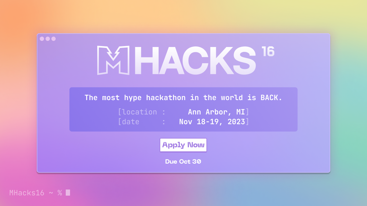
MHACKS 16
is the University of Michigan’s renowned hackathon, bringing together skilled builders, creatives, and thinkers to create some of the coolest projects you’ve ever seen! But to run an event like this, tons happen behind the scenes, and I got to be a part of their design language.
As well as deciding the theme for the year, I was involved with all things visual, from promos, to social media, flyers, and yet again.. Merch.

Working on the Shirts
The common sentiment for most merch requests is: more than just an ordinary shirt. Something people enjoy wearing, that to me was creative graphic design, bold and on brand. The theme we picked was related to a rainbow terminal, colorful coding, and pastel colors on fun graphics
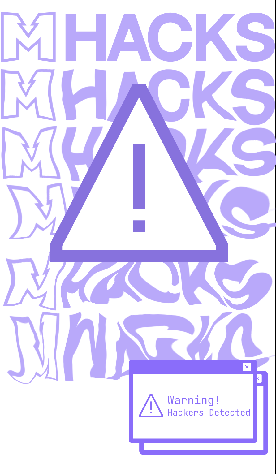
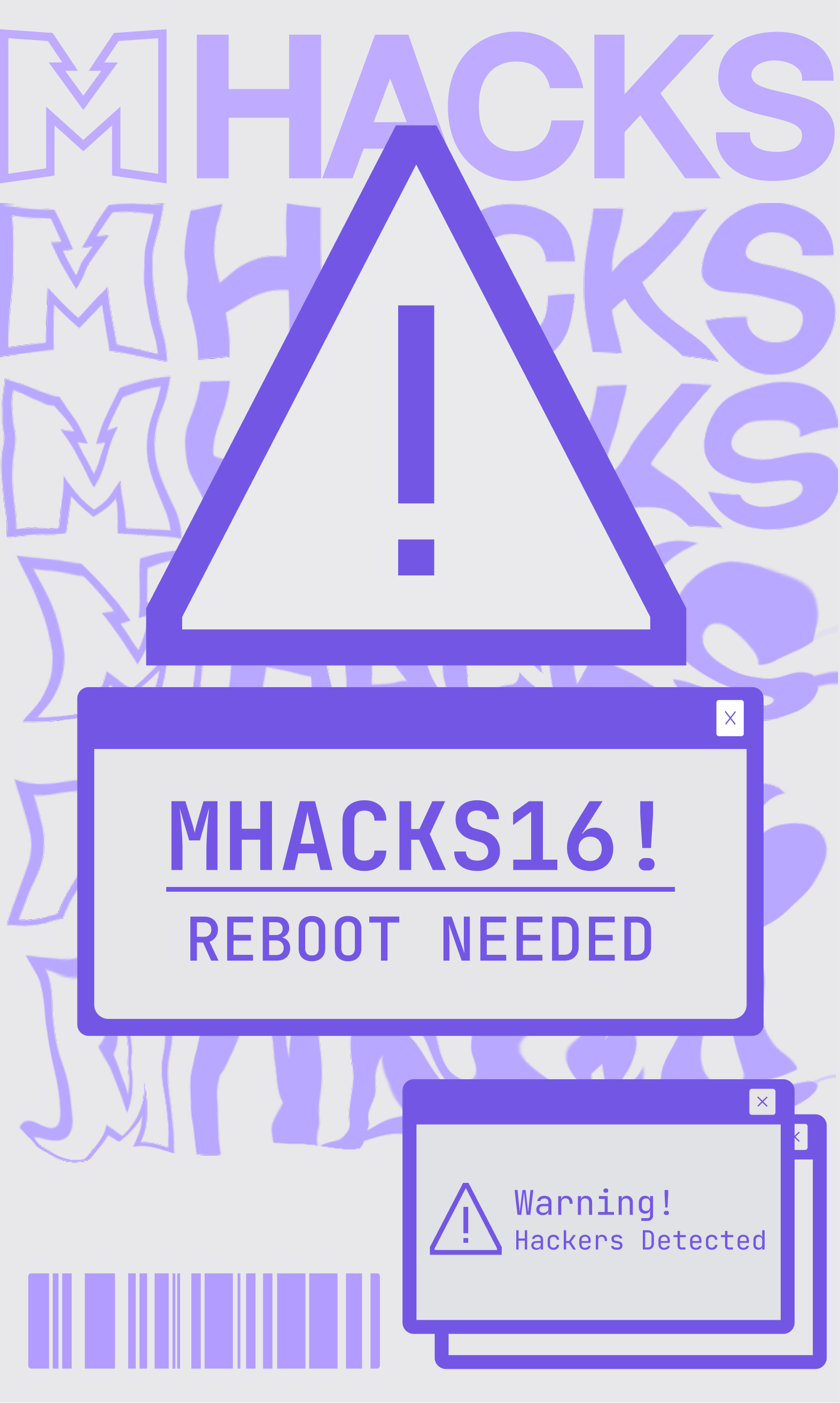
Original Concepts
Given free reign on the concepts, I was only told to make a shirt people would want to wear. I took to graphic artists and graphic tees for inspiration. To the right are some of my inspirations. I found the hope graphic and fell in love with it, trying to reframe that in the context of MHacks.
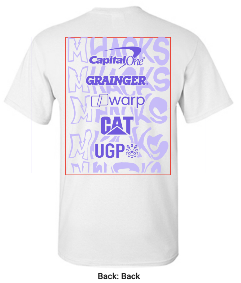
Below are some of the first renditions of the graphics and how it would look like on the shirts with sponsors included


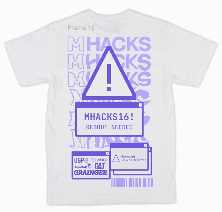
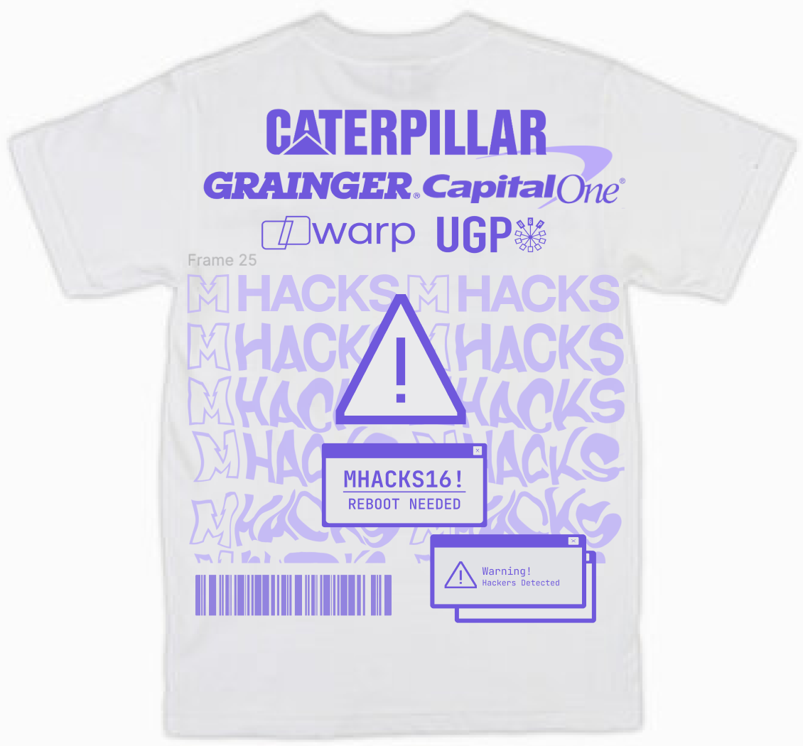

Unfortunately.. restrictions to the design were only specified after the graphics were made
1) Sponsor logos were promised to be one of the biggest parts of the shirt
2) The printing space on the tshirts are much smaller than early anticipated
It sucked to get rid of the hard work behind the earlier designs but the guidelines had to be followed. I repurposed the melted MHacks background and removed graphic elements, primarily keeping the focus on the sponsors. For the front, we kept the simple terminal element that was highlighted in the rest of our branding.

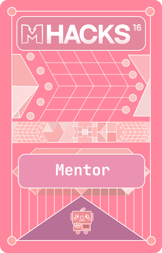
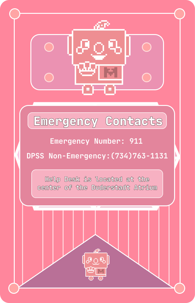
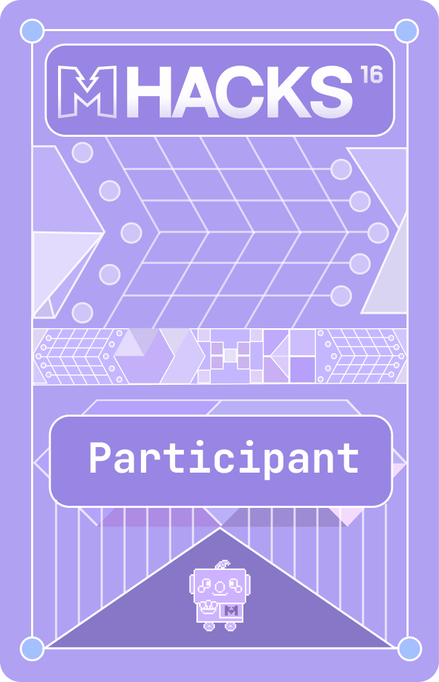
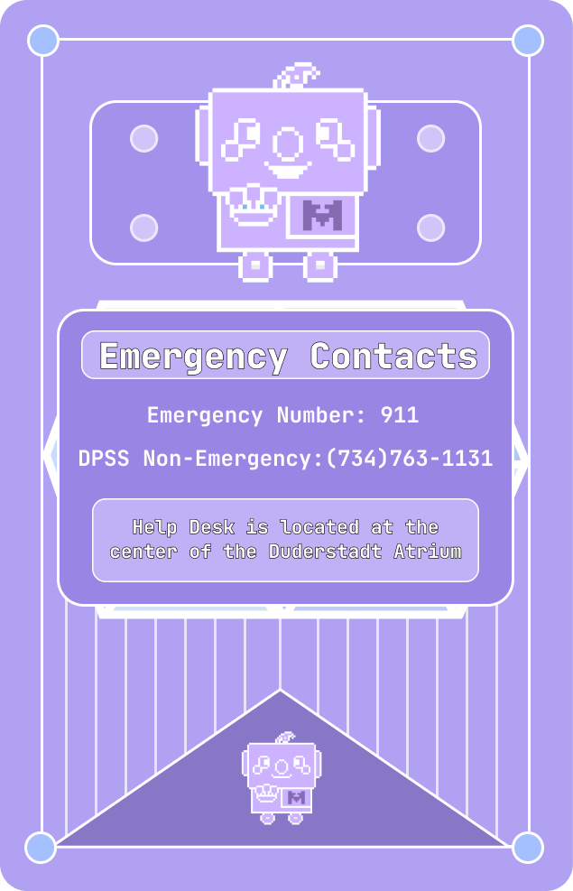
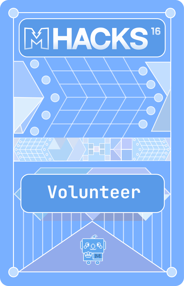
Extra: Another wearable we also got to design was the NFC cards for volunteers, judges, and participants. See below


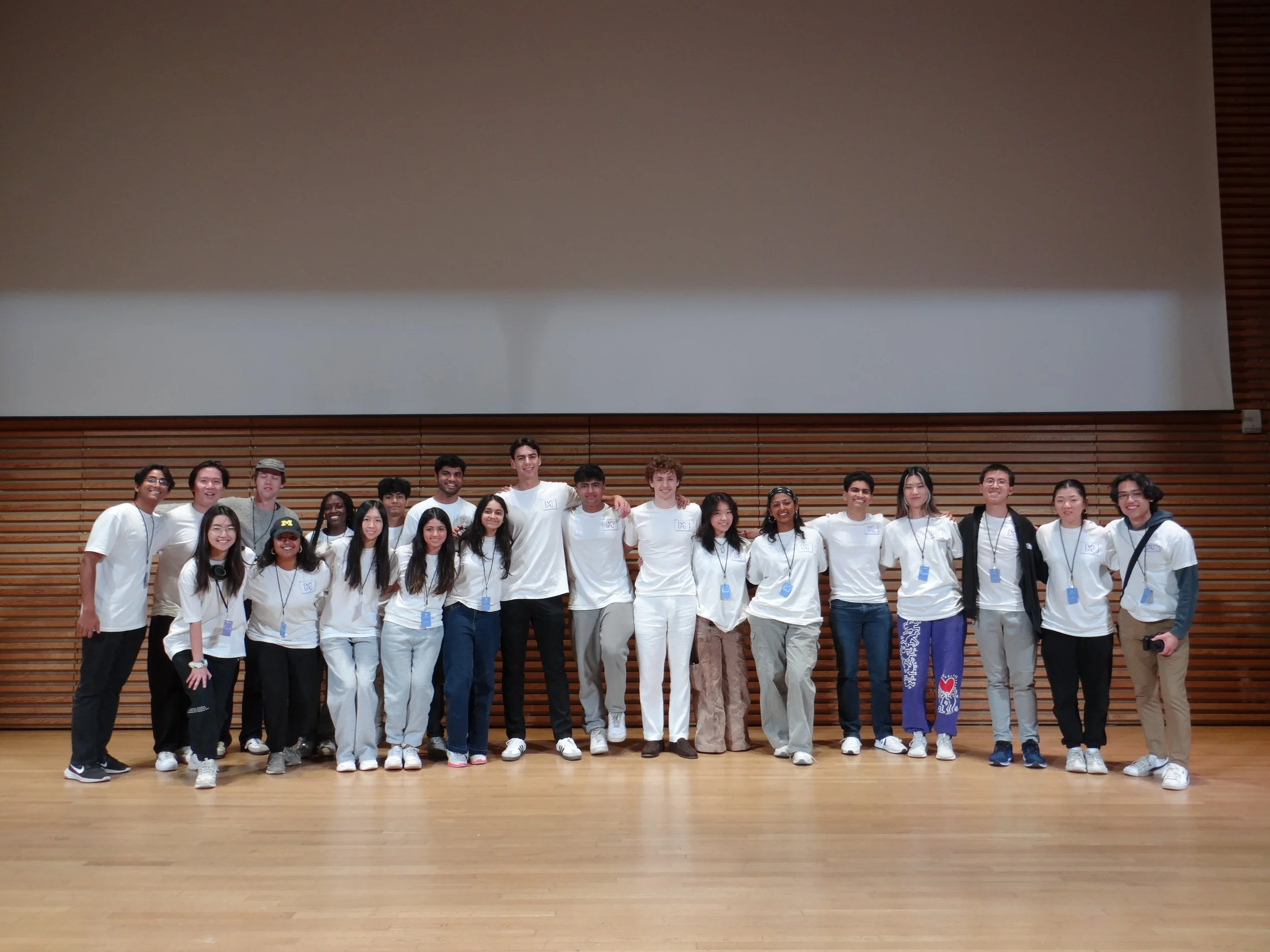
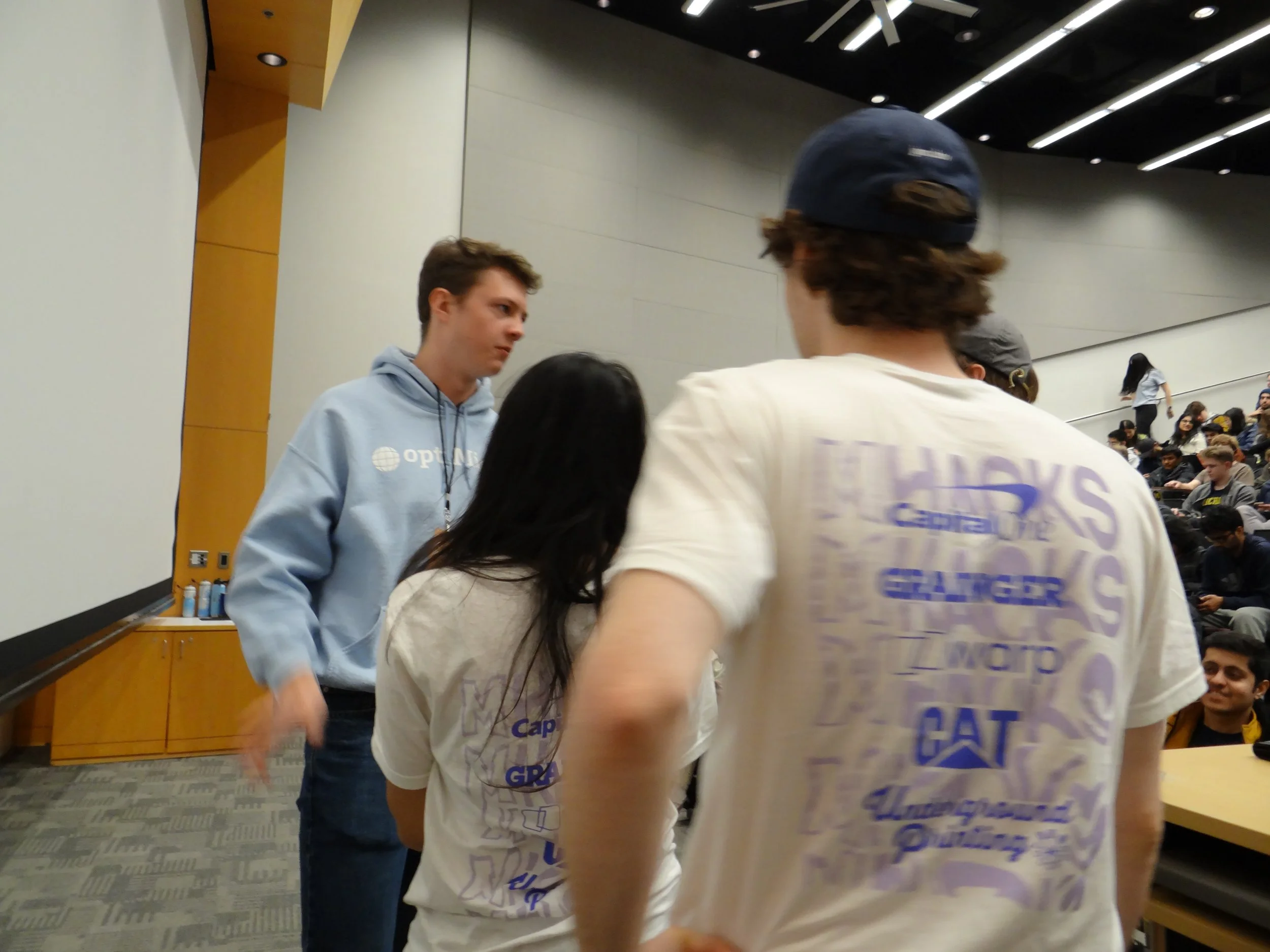
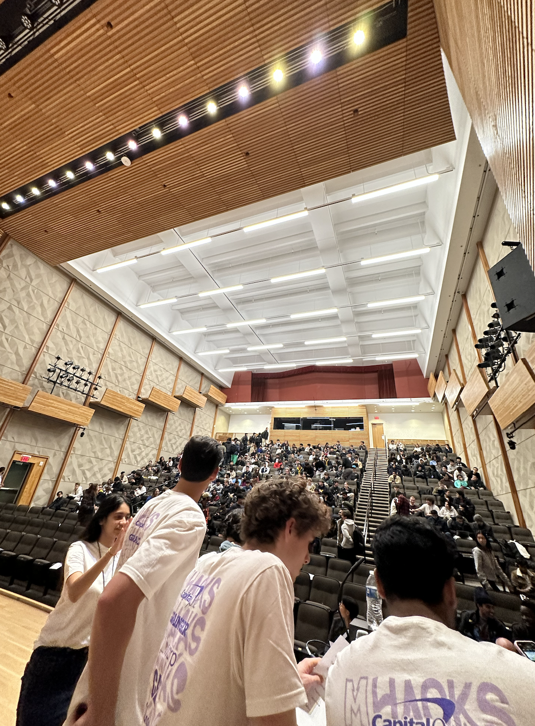
Seeing my work live, worn by people is the most rewarding part: